Anewgo
Anewgo
Anewgo


Client
Client
Client
Anewgo
Anewgo
Anewgo
Industries
Industries
Industries
Tech Real Estate Startup
Tech Real Estate Startup
Tech Real Estate Startup
Year
Year
Year
May 2022 - July 2022
May 2022 - July 2022
May 2022 - July 2022
Overview
Overview
Overview
I joined Anewgo, an online marketplace for new-built homes, in May of 2022 as they were preparing to launch their new website later that same summer.
Their site at the time had poor conversion, low usability, and confusing website navigation.
As their first and only ui/ux design intern, I was tasked with developing an appealing and intuitive website that would be more user-friendly and increase user trust.
Results
Results
Results
Interning at a fast-paced start-up was certainly challenging, but it pushed me to think quickly and be resourceful with the information given to me. I worked on pages across the entire life cycle of users, which allowed me to collaborate with various teams and stretch my design skills.
Summary:
Reduced the bounce rate for the landing page by 25%
Collaborated with engineers to improve the end-to-end experience of Anewgo by identifying UX issues and creating inclusive design solutions
Conducted a responsive redesign for 12+ pages across the Anewgo Market website
Created a brand guide including typography, iconography, and components
Brand Guide
Standardizing
visual design
Standardizing
visual design
Standardizing
visual design
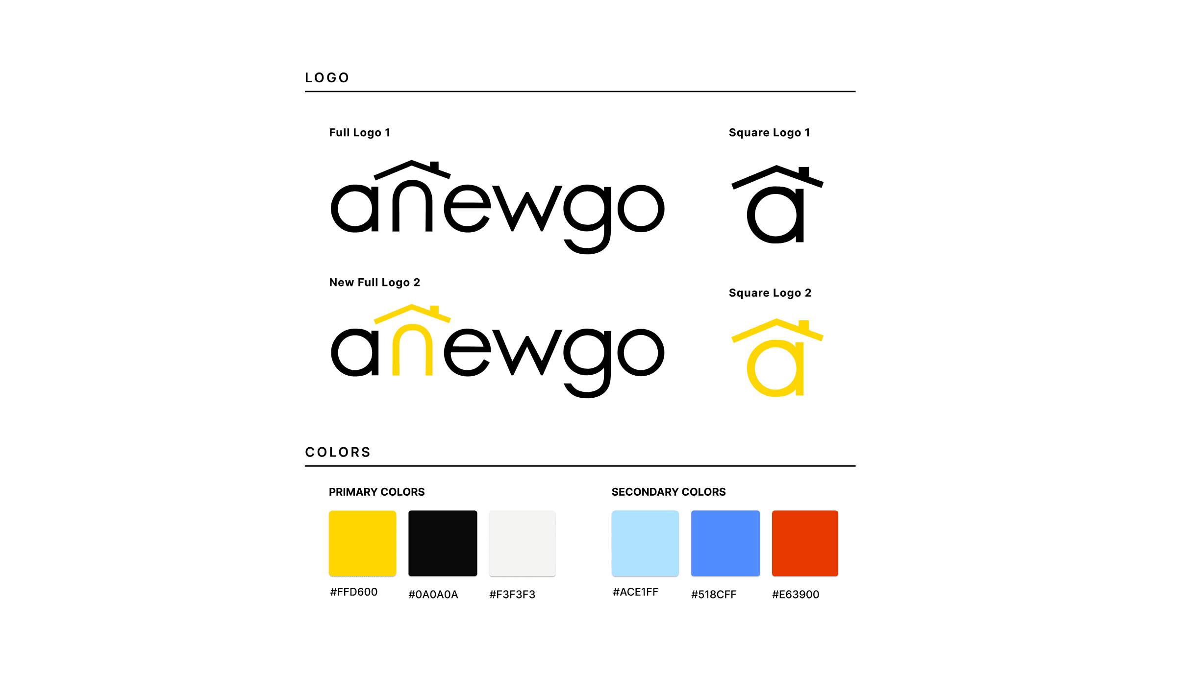


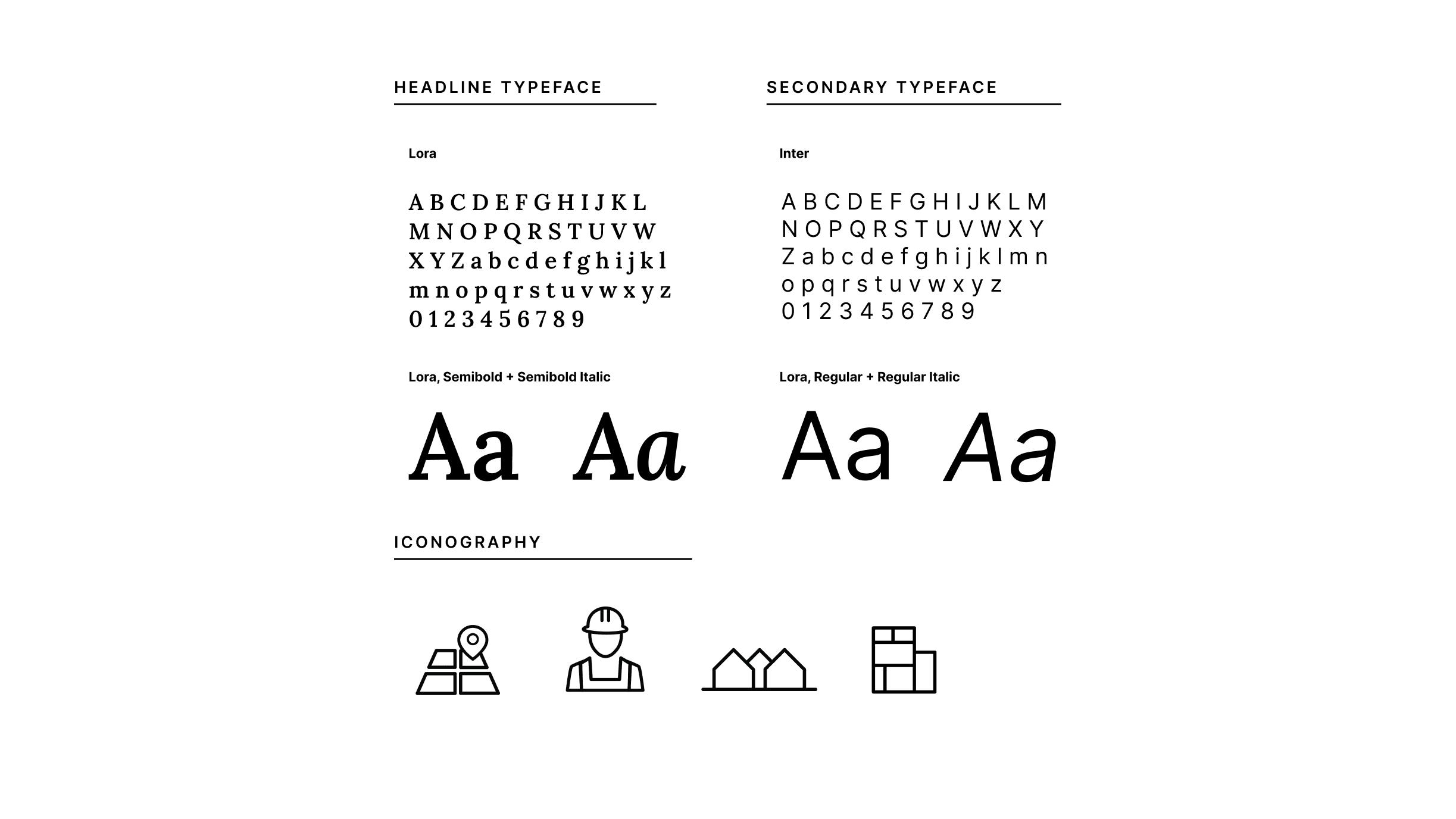


My first task was to standardize the visual elements across all web pages. This included: typography, colors, icons, components.
The goal here was to establish trust with users.
Previously:
various fonts were inconsistently applied
colors appeared dull and did not pass accessibility tests
buttons lacked clear differentiation between states (default, hover, active).
In response to this, I proposed and presented a style guide which can be viewed here.
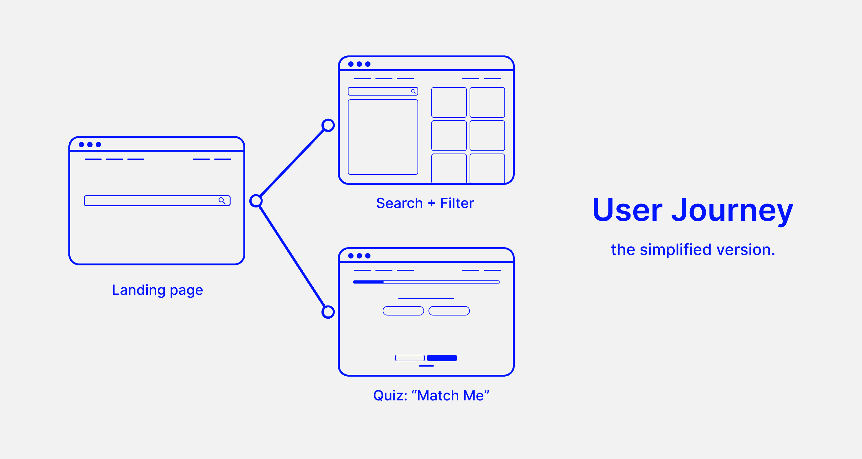


Search + Filter
Communities
Communities
Communities
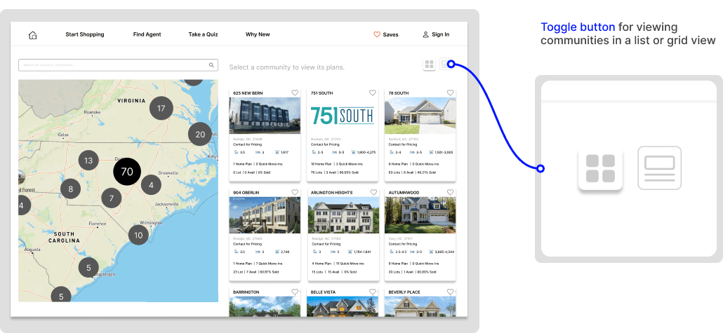


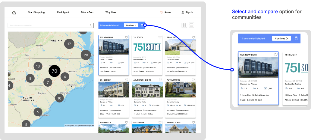


Under “shop now,” the primary subcategory I focused on was “communities.” At the time, users wanted to select and compare multiple communities, but there was no way to do so.
The new design features to address desires/painpoints:
Select and compare option for communities
Quick view button for comparing communities
Toggle button for viewing communities in a list or grid view
An option to “save” communities for future reference
Clear visual hierarchy within community cards
Search + Filter
Interactive Siteplan
Interactive Siteplan
Interactive Siteplan
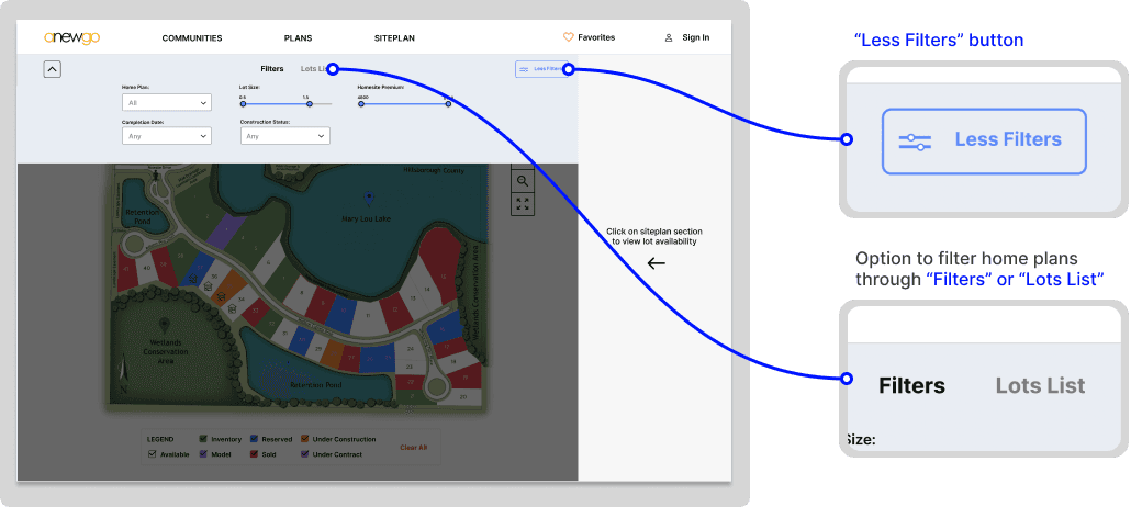


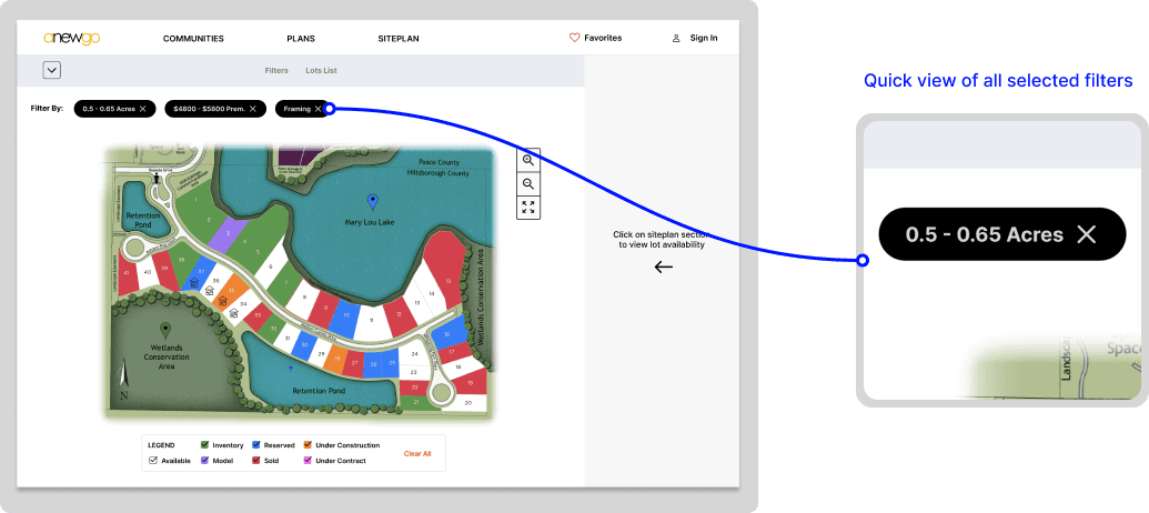


After users find a community they like, they should be able to choose a home plan and lot location to build their home on.
Previously conducted user tests revealed that the surplus of information in combination with the lack of white space on the siteplan page resulted in a frustrating experience.
I noticed that siteplan information availability varied depending on the builder's size. The challenge here was to create a page that accommodated to all scenarios.
As I began my research process, I consulted the VP of software and several engineers working on this feature to identify key element for the interactive siteplan.
Quiz
Match Me
Match Me
Match Me


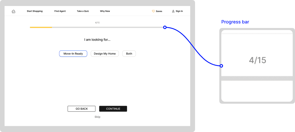


The second path a user can take when searching and filter for homes is through the “match me” feature. After completing a brief quiz, “match me” uses AI to pair users with their ideal home.
The problem:
• Lack of visual cues such as a progress bar
• Confusing navigation between quiz pages
• Quiz felt “flat” *
* After asking Anewgo’s CEO about the quiz functionality and what he would like to prioritize in this feature, he said that he would like to put the “fun” back in “function.” His comment indicated to me that we needed to take a gamified approach to the quiz. My goal was to inspire ideas of movement and achievement in users. After quickly researching gamification strategies, I chose to implement a progress bar, timed encouragement pages, and an animated celebration screen upon completing the quiz.
My Account
User Profile
User Profile
User Profile
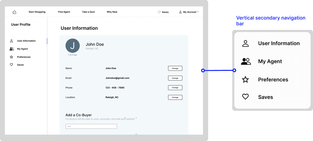
With the implementation of the “match me” and “saves” feature, Anewgo was in need of a profile for users. I collaborated with Anewgo’s CEO and CTO to pinpoint key subsections for the user profile-- one of them being the “saves” feature.
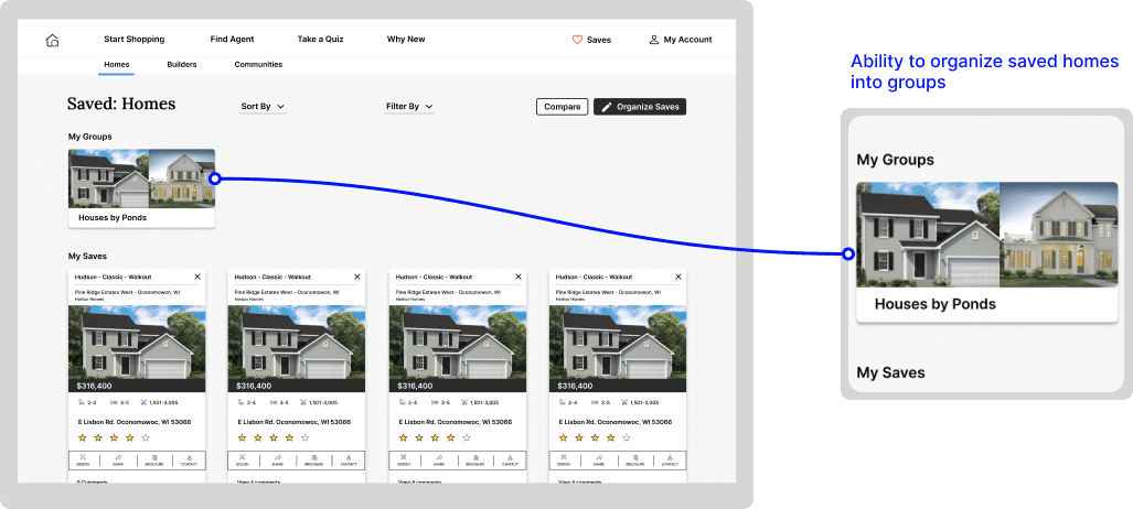
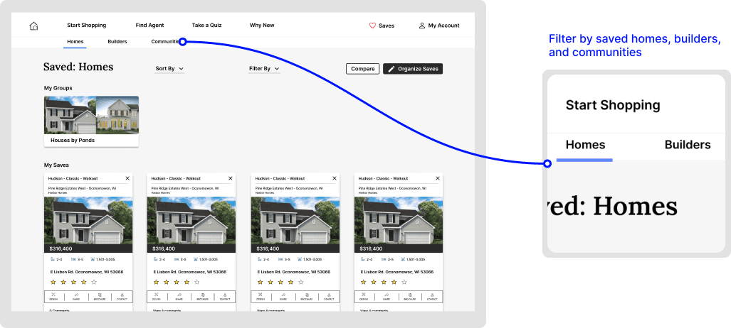
As we conversed, I noticed inconsistent language being used in reference to the “saves” feature. “Saves,” “likes,” and “favorites” were being used interchangeably. I later realized “saves” and “likes” were intended to be separate features.
I had a few questions regarding iconography and language, but the primary question was what is the difference between saves and likes?
After several discussions, I came to the conclusion that the two features were too similar to be implemented separately. In the end, I was able to successfully convince them to merge “saves” and “likes” into one.
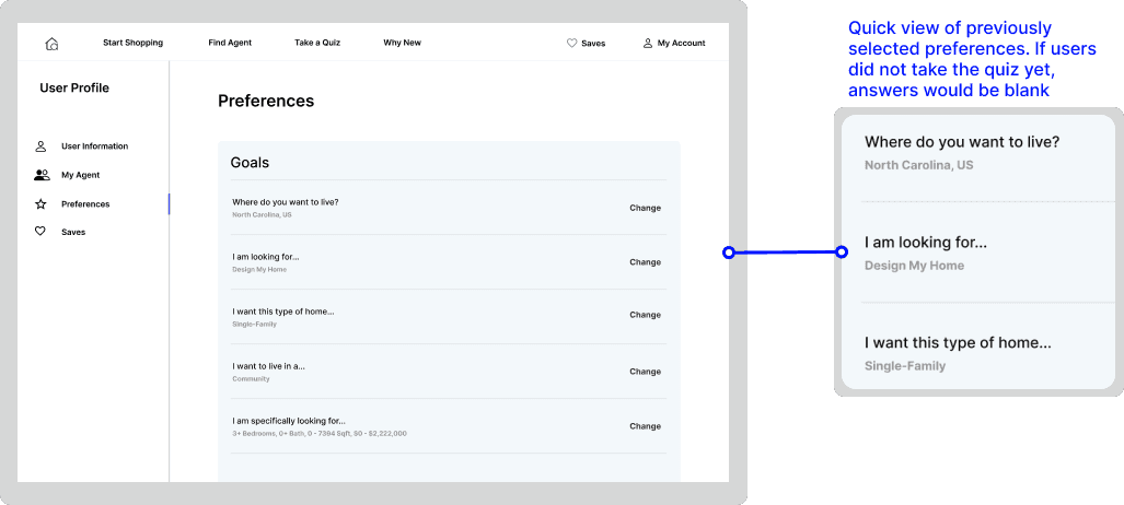
Similarly, “wishlist” and “preferences” were being used interchangeably. This was a result of the disconnect between company goals and familiar design patterns. This section is meant to function as a user’s “wishlist” of home features, but the language was not intuitive. The section name caused confusion within the company, so many began to refer to it as “preferences” out of convenience. If we were struggling to connect the name with the function, would users struggle as well? After doing research on familiar design patterns, I was able to convince the team to officially switch the language to “preferences.”




My Account
Saves
Saves
Saves




Conclusion
Takeaways
Takeaways
Takeaways
A few takeaways:
Design handoffs are important, but remaining involved throughout the implementation process is just as essential. The fast-paced nature caused me to rapidly progress horizontally across the website. I would have liked to stay with a vertical pillar, like the interactive siteplan, until completion.
Set aside time for detailed user research. If I had more time, I would have liked to do failure mapping across all web pages. It would have provided me with better insights into the crucial information needed in my design decisions.
Question everything. Good questions give insights to what’s working and what’s not. During a few instances, when I encountered a pre-existing feature or was requested to include a new one on a page, I probed its purpose. Upon careful evaluation, we realized that the feature didn't contribute any significant value to the overall design.
© Kaitlyn Miyamoto 2023