Understand our users
User Interviews
Understanding the Users Through Interviews
01. Understand user pain points when navigating the Toronto Cupcake website
02. What types of things do our users expect to see and do if they visited a cupcake bakery website?
Plan
Heuristic Evaluation of the current Toronto Cupcake website
5 usability test on the current Toronto Cupcake website
Survey participants from the general public about their expectations when visiting a bakery website
Stakeholder interview with the Toronto Cupcakes lead web designer
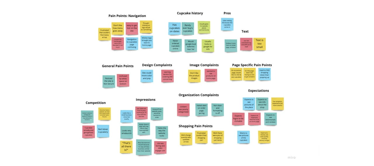
Above: Categorized usability feedback, with each color representing a unique participant
Understand our users
Stakeholder Interview
Ideation
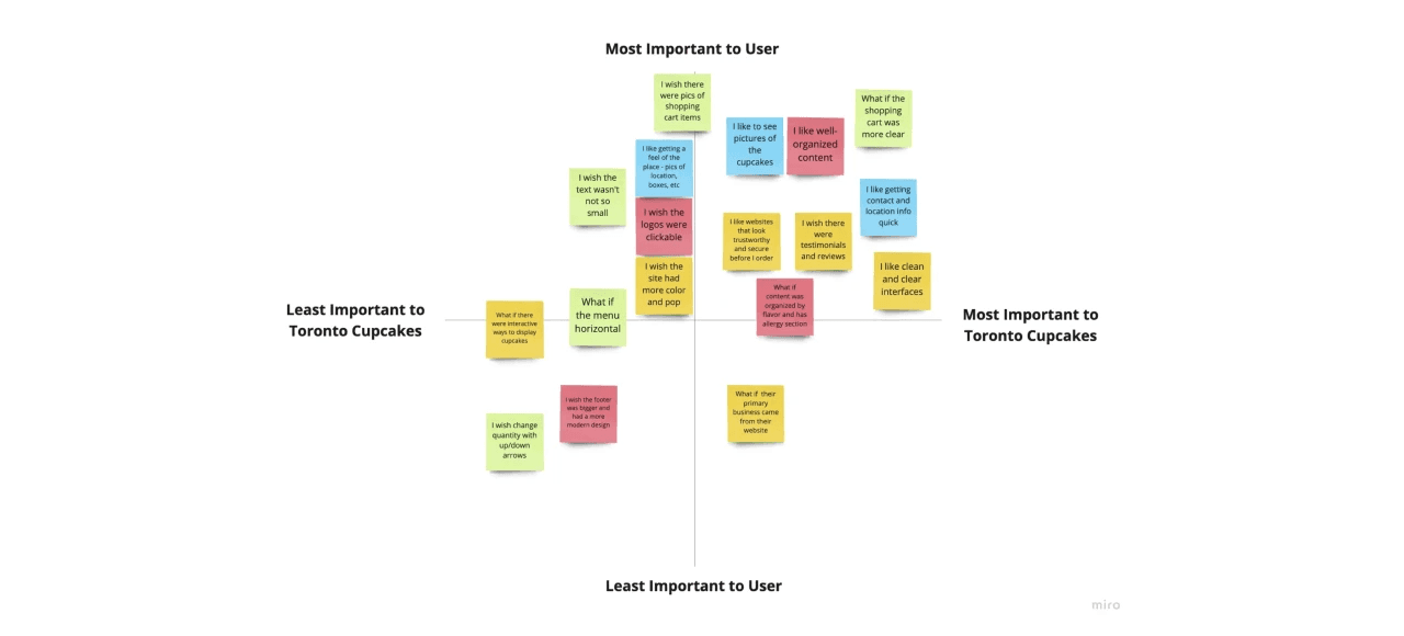
From the opportunities that have been found in the user interviews, I created a priority matrix to consider which opportunities I will implement into design improvements.
results
User Flow
Results
Wireframes
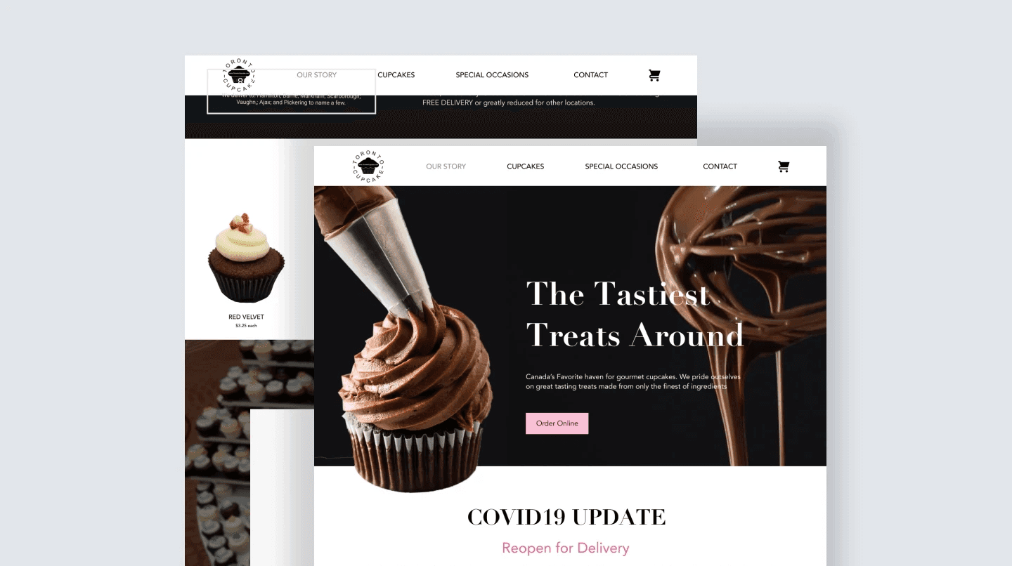
A bold, chic brand
High contrast with pops of bright pink ensure Toronto Cupcakes leaves a lasting impression with users. Using high quality images, we decided to minimize the text and let the cupcakes speak for themselves.
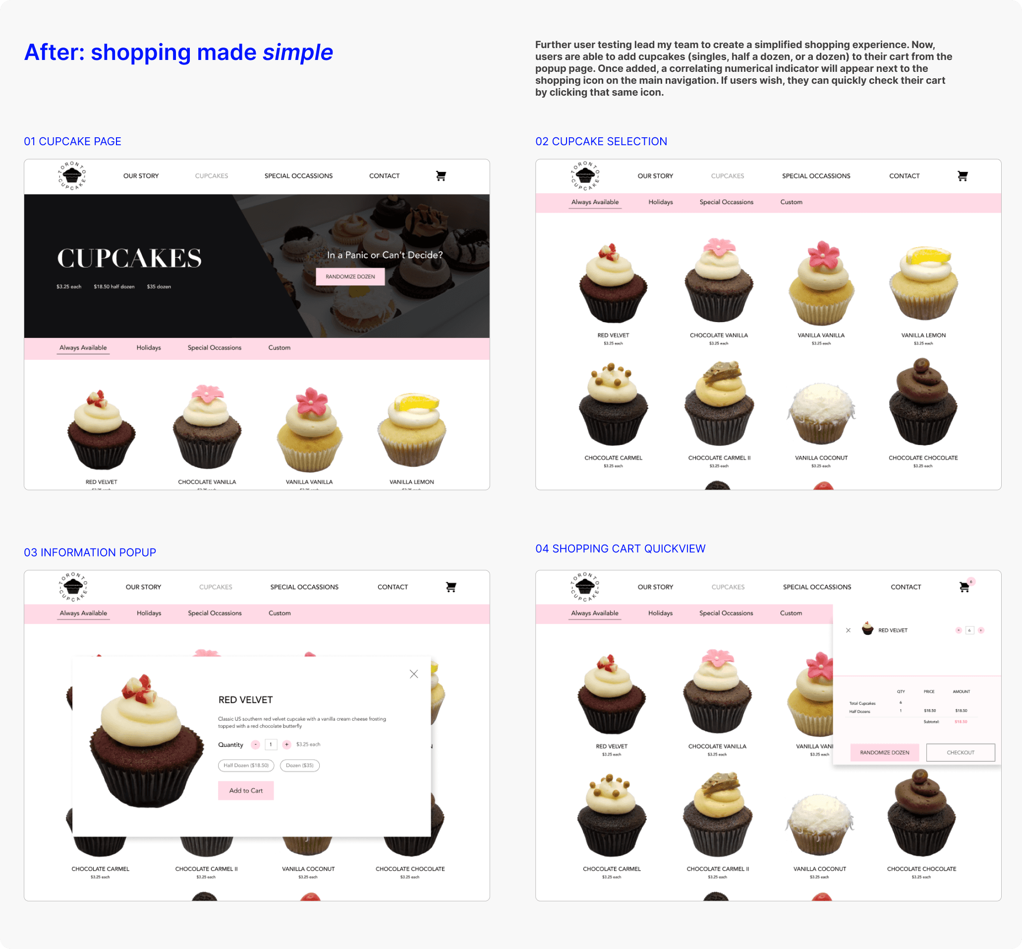
Shop for cupcakes in less time
Users now can add cupcakes (single, half dozen, or dozen) from the popup page.
Conclusion
Takeaways
You can view our website here
While my team had some challenges when designing the new website for Toronto Cupcakes, we learned a lot and grew as designers. We specifically had a difficult time with the product photos the company sent us. We had to individually re-edit each cupcake, which can be seen in our final coded prototype.
Moving forward, it would be interesting to look into incorporating third-party review from sites like yelp. It would also be interesting to translate the Toronto Cupcake website into an app, for a more user-friendly mobile experience.
© Kaitlyn Miyamoto 2023


